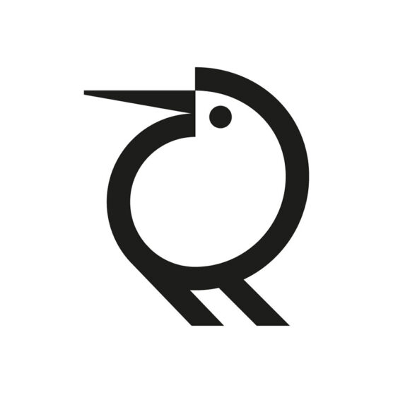
2nd Place Winner – Wave #16
DESIGNER(S)
Rafael Barahona, Abby Graber, Jessica Isch and Jordan Kauffman
AGENCY
Lightbox
CLIENT
Goshen Public Library
TAGS
LOGO, IDENTITY
Description
Following a recently formulated strategic plan, Goshen Public Library underwent a rebrand that would better visually articulate their new mission and vision.
We set out to create a visual identity that was vibrant, and carried with it the sense of deep enrichment that comes with being fully engaged. What ultimately emerged was a stylized bilingual wordmark, appropriate for an organization that specializes in written communication. Playfully incorporated in the wordmark is a question mark, denoting the library as a place to explore curiosities, and an exclamation point, referring to the excitement of learning. The Spanish version of the logo features an interrobang. This playful yet sophisticated visual identity signals the beginning of a bright new era ahead. Case Study here.

1st – Francesco Vittorioso
2nd – Zalo Estévez

3rd – Dmitry Lepisov

4th – Costa Mamangakis

5th – Lorenzo Decaro

1st Place – Ramprasad Raju

2nd Place – Tyler Frisbee

3rd Place – Daniele Maniezzo

4th Place – James Barnard

5th Place – Paulo Rogerio

1st Place – Madeleine Godwin

2nd Place – Tyler Frisbee
3rd Place – Zalo Estévez

4th Place – Motif Brands

5th Place – Tyler Frisbee

1st Place – Liam Warsop

2nd Place – LightBox

3rd Place – Aaron Johnson

4th Place – Ilan Geva

5th Place – James Barnard

1st – Jason Craig

2nd – Juan Carlzon

3rd – Emanuele Abrate

4th – Mateusz Machalski

5th – Tyler Frisbee

1st Place – Emanuele Abrate

2nd Place – Jon Allison
3rd Place – Matt Esckelson

4th – Francesco Vittorioso

5th Place – Diana Molyte

1st Place – Carlos Fernandez

2nd Place – Tyler Frisbee

3rd Place – Björn Berglund

4th Place – Motif Brands

5th Place – Jon Allison

1st Place – Matt Esckelson

2nd Place – Kieran Hawes

3rd Place – Aaron Johnson

4th Place – Hashem Gerashi
5th Place – Peper Pascual

1st Place – Carlos Fernandez

2nd Place – Adolfo Teixeira

3rd Place – Christopher Reed

4th Place – Adolfo Teixeira

5th Place – Carlos Fernandez

1st Place – Kamran Akram

2nd Place – Emanuele Abrate

3rd Place – Jon Allison

4th Place – Shyam Agarwal

5th Place – Logan Brazeau
1st Place – Marcin Usarek
2nd Place – Logan Brazeau
3rd Place – Aaron Johnson
4th Place – Liam Warsop
5th Place – Charlotte Downs

1st Place – Neil Bowen

2nd – Bob Mytton & Ed Robin
3rd Place – Martyn Hellewell

4th Place – Shaun Green

5th Place – Logan Brazeau
1st Place – Filippos Pente
2nd Place – Shift Design
3rd Place – Shift Design
5th Place – Steve Leacock

4th Place – Martyn Hellewell
2nd Place – Liam Jackson
3rd Place – Mr Simc
4th – Costa Mamangakis
5th Place – Mark Farris

1st Place – Mr. Simc
2nd Place – Justen Hong

4th – Katherine Howell-Kiser

5th Place – Rich Scott

1st Place – Tandem

2nd Place – Chris Grey
3rd Place – Filippos Pente
4th Place – Filippos Pente
5th Place – Rocky Gonzales
1st Place – Filippos Pente
2nd – Costa Mamangakis

3rd Place – Kira Chao
4th Place – Jon Ringger
5th Place – Shyam Agarwal
1st Place – Frauke Meyer
2nd Place – Filippos Pente
3rd Place – Casandra Clark

4th Place – Chris Grey
5th Place – Sam Aylard
1st Place – Samadara Ginige
2nd – Costa Mamangakis

3rd Place – Corinna Djaferis
4th Place – Nuno Pereira