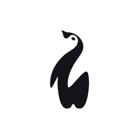
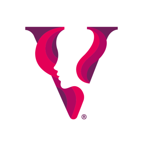
5th Place Winner – Wave #20
DESIGNER
Filippo Barina
AGENCY
Filippo Barina
CLIENT
Libra
TAGS
LOGO DESIGN, IDENTITY, BRANDING
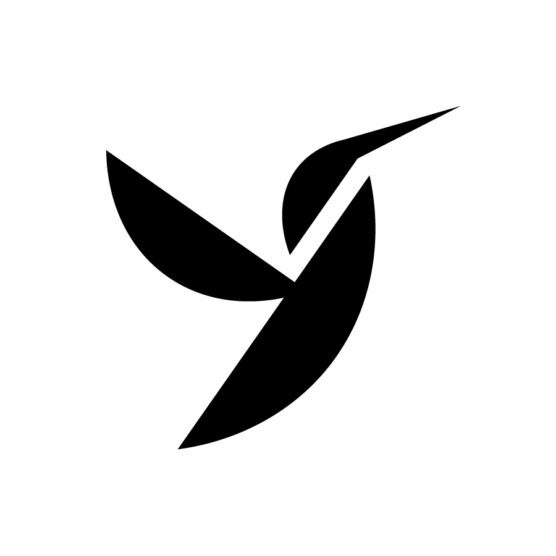
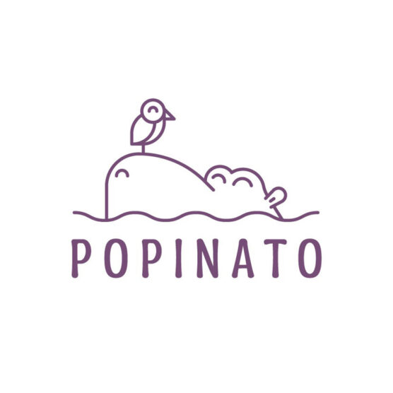
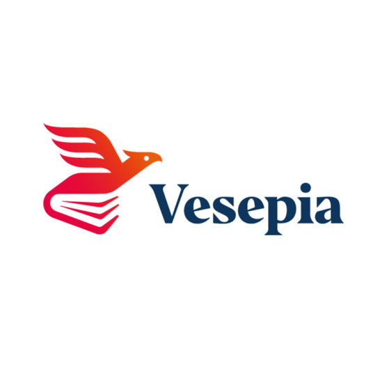
Description
I designed this logo for Libra, an Italian startup, a team of professionals who provide physiotherapy, osteopathy, kinesiology, and fitness treatments.
Libra’s mission is: We help people free themselves from limits and stiffness. We do this because we want our patients to be able to move with lightness and ease, writing their own story of health and well-being. A story where the body is truly free to express itself and maybe even, who knows… to fly (in italian – librare).
I designed a symbolic logo featuring a stylized hummingbird for several reasons:
1) Verbal Assonance: The name “Libra” has a verbal assonance with the Italian word for hummingbird, “Colibrì.”
2) The Concept of Flying: The hummingbird embodies the very concept of flying. In Italian, a synonym for “volare” (to fly) is “librare.”
3) Symbolism: The hummingbird represents lightness, movement, skill, and journey. In many cultures, hummingbirds symbolize positivity, lightness, and the ability to overcome difficulties, such as physical pain. And all of this is aligned with the brand mission.
4) Memorability of simples shapes: From a technical and compositional standpoint, the logo is simple and intuitive to make it easily memorable. Within the intersection of the wing, head, and body, you can glimpse the letter “L,” the initial of “Libra.” Thanks to its simple geometric forms, the visual identity will come to life from these shapes, creating continuity and visual consistency across all brand assets.

1st – Tyler Frisbee

2nd – Kamran Akram

3rd Place – Carlos Fernandez

4th Place – Eva Nestell
5th Place – Filippo Barina
1st – Francesco Vittorioso
2nd – Zalo Estévez

3rd – Dmitry Lepisov

4th – Costa Mamangakis

5th – Lorenzo Decaro

1st Place – Ramprasad Raju
2nd Place – Tyler Frisbee

3rd Place – Daniele Maniezzo

4th Place – James Barnard

5th Place – Paulo Rogerio

1st Place – Madeleine Godwin

2nd Place – Tyler Frisbee
3rd Place – Zalo Estévez

4th Place – Motif Brands
5th Place – Tyler Frisbee

1st Place – Liam Warsop

2nd Place – LightBox

3rd Place – Aaron Johnson
4th Place – Ilan Geva

5th Place – James Barnard
1st – Jason Craig

2nd – Juan Carlzon

3rd – Emanuele Abrate
4th – Mateusz Machalski

5th – Tyler Frisbee

1st Place – Emanuele Abrate

2nd Place – Jon Allison
3rd Place – Matt Esckelson
4th – Francesco Vittorioso

5th Place – Diana Molyte
1st Place – Carlos Fernandez

2nd Place – Tyler Frisbee
3rd Place – Björn Berglund

4th Place – Motif Brands

5th Place – Jon Allison

1st Place – Matt Esckelson
2nd Place – Kieran Hawes

3rd Place – Aaron Johnson
4th Place – Hashem Gerashi
5th Place – Peper Pascual
1st Place – Carlos Fernandez

2nd Place – Adolfo Teixeira

3rd Place – Christopher Reed

4th Place – Adolfo Teixeira

5th Place – Carlos Fernandez

1st Place – Kamran Akram
2nd Place – Emanuele Abrate

3rd Place – Jon Allison

4th Place – Shyam Agarwal

5th Place – Logan Brazeau
1st Place – Marcin Usarek
2nd Place – Logan Brazeau
3rd Place – Aaron Johnson
4th Place – Liam Warsop
5th Place – Charlotte Downs

1st Place – Neil Bowen

2nd – Bob Mytton & Ed Robin
3rd Place – Martyn Hellewell

4th Place – Shaun Green
5th Place – Logan Brazeau
1st Place – Filippos Pente
2nd Place – Shift Design
3rd Place – Shift Design
5th Place – Steve Leacock

4th Place – Martyn Hellewell
2nd Place – Liam Jackson
3rd Place – Mr Simc
4th – Costa Mamangakis
5th Place – Mark Farris

1st Place – Mr. Simc
2nd Place – Justen Hong

4th – Katherine Howell-Kiser

5th Place – Rich Scott
1st Place – Tandem

2nd Place – Chris Grey
3rd Place – Filippos Pente
4th Place – Filippos Pente
5th Place – Rocky Gonzales
1st Place – Filippos Pente
2nd – Costa Mamangakis

3rd Place – Kira Chao
4th Place – Jon Ringger
5th Place – Shyam Agarwal
1st Place – Frauke Meyer
2nd Place – Filippos Pente
3rd Place – Casandra Clark

4th Place – Chris Grey
5th Place – Sam Aylard
1st Place – Samadara Ginige
2nd – Costa Mamangakis

3rd Place – Corinna Djaferis
4th Place – Nuno Pereira