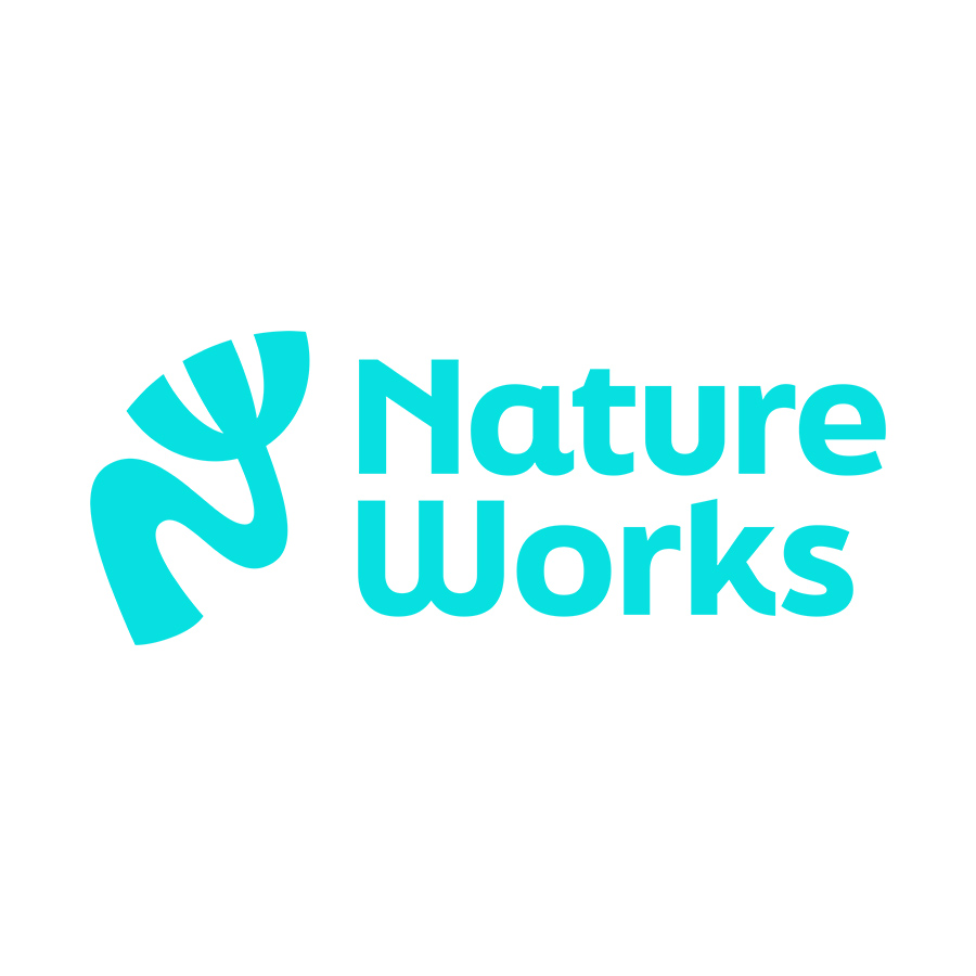
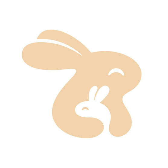
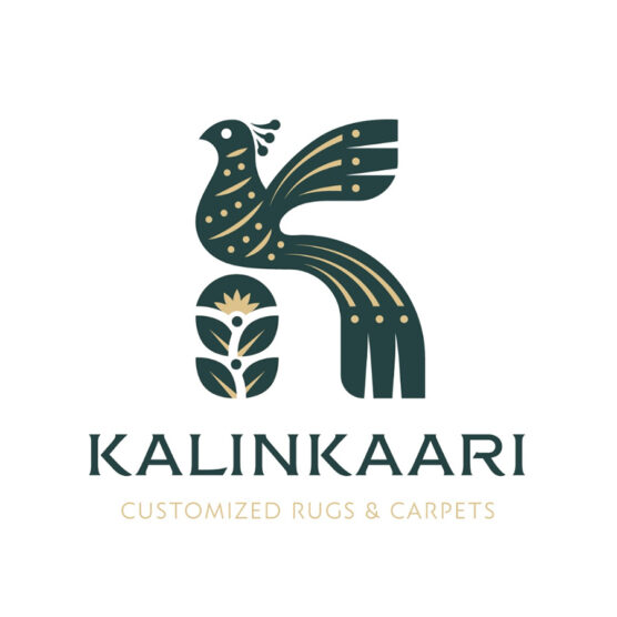
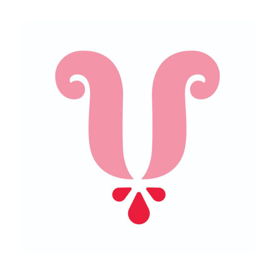
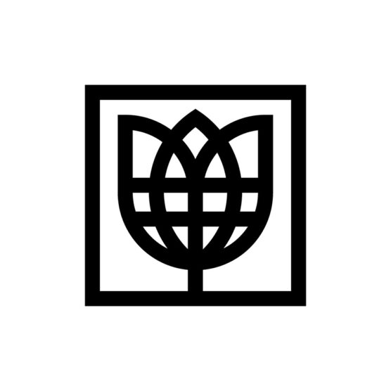
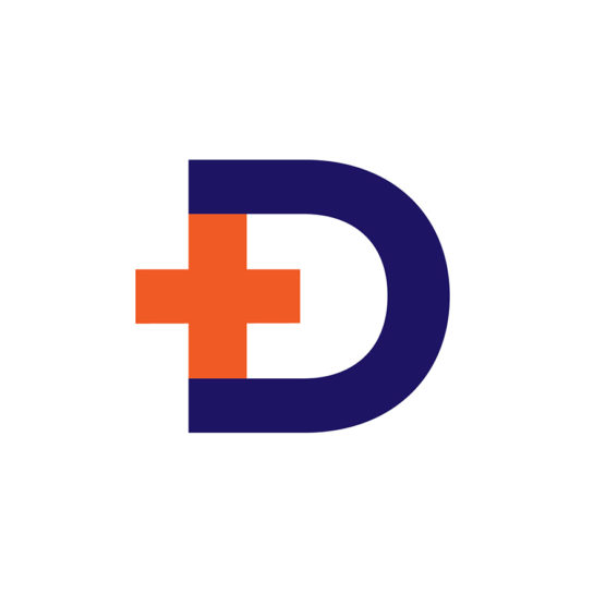
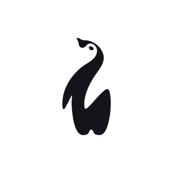
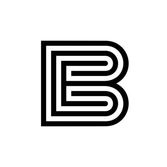
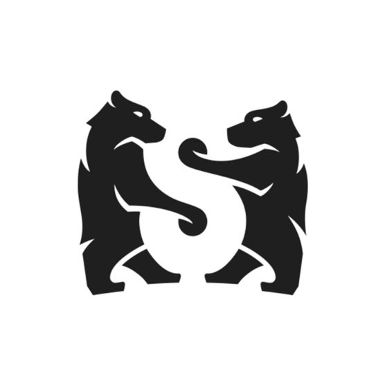
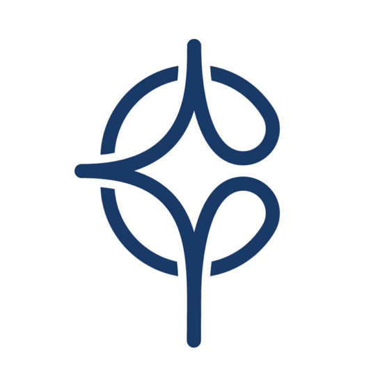
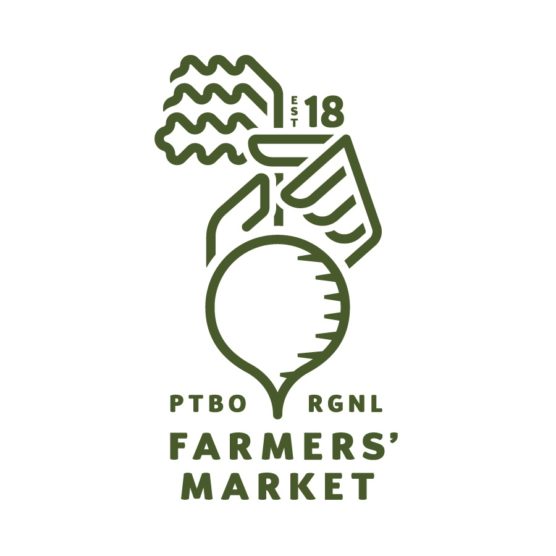
2nd Place Winner – Wave #20
DESIGNER
Kamran Akram
AGENCY
Studio Akram
CLIENT
Nature Works
TAGS
LOGO, IDENTITY
Description
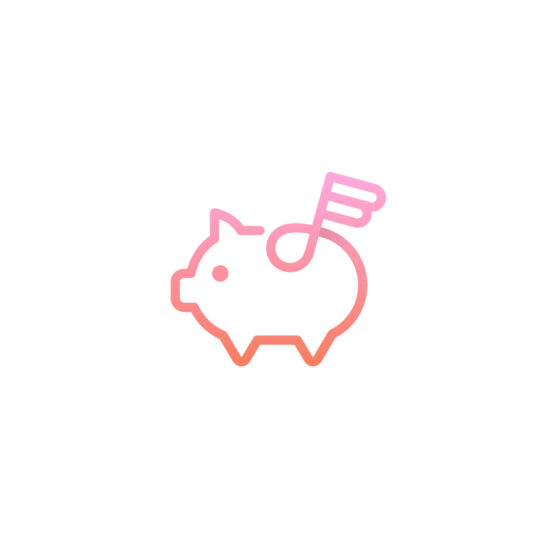
Nature Works a company that focus on regenerative agriculture projects, creating habitats, increasing bio abundance, re wilding, mapping, bridge woodlands and fields, for estates across the UK.
The client wanted a bold and confident and distinctive logo to represent their approach and personality. I created the concept ‘The Journey to regeneration’ to represent how closely Nature Works work with their clients, real advice, wild results. The logo symbol its constructed of a monogram of an N and W, the N starts the journey and forms a connected pathway an abstract flower W shape, it symbolises the flourishing biodiversity that Nature Works brings to their projects, the pathway also represents the river systems that are integral to regenerative agriculture projects creating thriving biodiversity.
A bright teal colour was chosen for its distinctive modern and punchy to stand out in a sector that uses traditional greens and blues. The logotype set in FinalSix was chosen for its friendly and unique curves that nod to the forms of tree branches working harmoniously with the organic free flowing nature of the symbol.

1st – Tyler Frisbee

2nd – Kamran Akram

3rd Place – Carlos Fernandez
4th Place – Eva Nestell
5th Place – Filippo Barina
1st – Francesco Vittorioso
2nd – Zalo Estévez
3rd – Dmitry Lepisov
4th – Costa Mamangakis

5th – Lorenzo Decaro
1st Place – Ramprasad Raju
2nd Place – Tyler Frisbee
3rd Place – Daniele Maniezzo
4th Place – James Barnard

5th Place – Paulo Rogerio
1st Place – Madeleine Godwin
2nd Place – Tyler Frisbee
3rd Place – Zalo Estévez
4th Place – Motif Brands
5th Place – Tyler Frisbee
1st Place – Liam Warsop
2nd Place – LightBox
3rd Place – Aaron Johnson
4th Place – Ilan Geva
5th Place – James Barnard
1st – Jason Craig

2nd – Juan Carlzon
3rd – Emanuele Abrate
4th – Mateusz Machalski

5th – Tyler Frisbee
1st Place – Emanuele Abrate
2nd Place – Jon Allison
3rd Place – Matt Esckelson
4th – Francesco Vittorioso
5th Place – Diana Molyte
1st Place – Carlos Fernandez
2nd Place – Tyler Frisbee
3rd Place – Björn Berglund
4th Place – Motif Brands
5th Place – Jon Allison
1st Place – Matt Esckelson
2nd Place – Kieran Hawes
3rd Place – Aaron Johnson
4th Place – Hashem Gerashi
5th Place – Peper Pascual
1st Place – Carlos Fernandez

2nd Place – Adolfo Teixeira
3rd Place – Christopher Reed
4th Place – Adolfo Teixeira
5th Place – Carlos Fernandez
1st Place – Kamran Akram
2nd Place – Emanuele Abrate
3rd Place – Jon Allison
4th Place – Shyam Agarwal
5th Place – Logan Brazeau
1st Place – Marcin Usarek
2nd Place – Logan Brazeau
3rd Place – Aaron Johnson
4th Place – Liam Warsop
5th Place – Charlotte Downs
1st Place – Neil Bowen
2nd – Bob Mytton & Ed Robin
3rd Place – Martyn Hellewell
4th Place – Shaun Green
5th Place – Logan Brazeau
1st Place – Filippos Pente
2nd Place – Shift Design
3rd Place – Shift Design
5th Place – Steve Leacock
4th Place – Martyn Hellewell
2nd Place – Liam Jackson
3rd Place – Mr Simc
4th – Costa Mamangakis
5th Place – Mark Farris
1st Place – Mr. Simc
2nd Place – Justen Hong
4th – Katherine Howell-Kiser
5th Place – Rich Scott
1st Place – Tandem
2nd Place – Chris Grey
3rd Place – Filippos Pente
4th Place – Filippos Pente
5th Place – Rocky Gonzales
1st Place – Filippos Pente
2nd – Costa Mamangakis
3rd Place – Kira Chao
4th Place – Jon Ringger
5th Place – Shyam Agarwal
1st Place – Frauke Meyer
2nd Place – Filippos Pente
3rd Place – Casandra Clark
4th Place – Chris Grey
5th Place – Sam Aylard
1st Place – Samadara Ginige
2nd – Costa Mamangakis
3rd Place – Corinna Djaferis
4th Place – Nuno Pereira