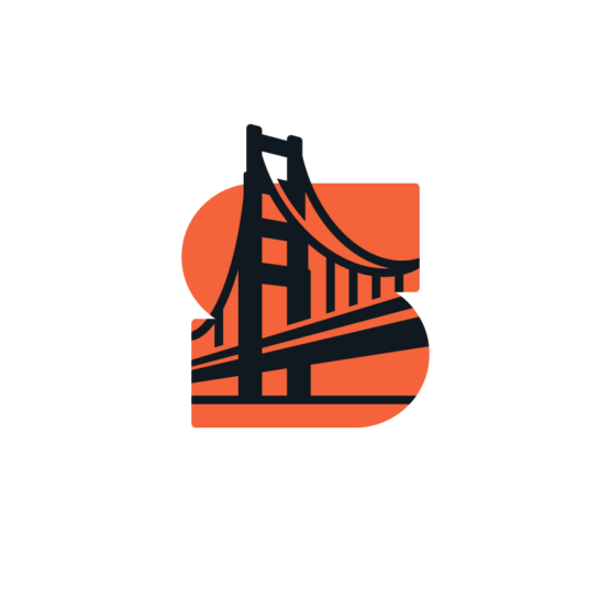
4th Place Winner – Wave #20
DESIGNER
Eva Nestell
AGENCY
Nestell Brand Design
CLIENT
Minpro Recycling
TAGS
LOGO DESIGN, IDENTITY, BRANDING
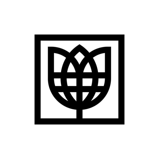
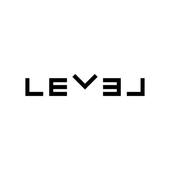
Description
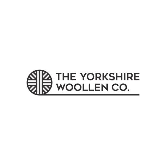
Minpro Recycling transforms complex waste challenges into smart, sustainable solutions, taking the recycling of hazardous waste to new heights. Their goal is to stand out as a trustworthy and professional partner in an industry often marked by unreliable players.
Minpro turned to me to develop a new visual identity that would convey trust and credibility, helping to position them as a leading, reliable force in the industry.
While bringing that vision to life, I also wanted to find a way to capture the recycling process yet avoiding the clichéd symbolism often used within the recycling industry. The mark has a hexagonal shape, a geometry that evokes a shield or a badge, conveying stability and safety. To echo the different stages of the recycling process I divided the shape into segments which can be seen as compartments and phases in the recycling process.
This way the mark also plays with perspective, forming an optical illusion of a cube or a box, symbolizing Minpro’s “complete solutions” approach. It’s a distinctive mark that radiates trust while mirroring the layered work that Minpro Recycling do.

1st – Tyler Frisbee

2nd – Kamran Akram

3rd Place – Carlos Fernandez

4th Place – Eva Nestell

5th Place – Filippo Barina

1st – Francesco Vittorioso

2nd – Zalo Estévez

3rd – Dmitry Lepisov
4th – Costa Mamangakis

5th – Lorenzo Decaro

1st Place – Ramprasad Raju

2nd Place – Tyler Frisbee

3rd Place – Daniele Maniezzo

4th Place – James Barnard

5th Place – Paulo Rogerio

1st Place – Madeleine Godwin

2nd Place – Tyler Frisbee
3rd Place – Zalo Estévez

4th Place – Motif Brands
5th Place – Tyler Frisbee
1st Place – Liam Warsop

2nd Place – LightBox

3rd Place – Aaron Johnson

4th Place – Ilan Geva

5th Place – James Barnard

1st – Jason Craig

2nd – Juan Carlzon
3rd – Emanuele Abrate

4th – Mateusz Machalski

5th – Tyler Frisbee

1st Place – Emanuele Abrate

2nd Place – Jon Allison
3rd Place – Matt Esckelson

4th – Francesco Vittorioso

5th Place – Diana Molyte
1st Place – Carlos Fernandez

2nd Place – Tyler Frisbee
3rd Place – Björn Berglund

4th Place – Motif Brands

5th Place – Jon Allison
1st Place – Matt Esckelson

2nd Place – Kieran Hawes

3rd Place – Aaron Johnson
4th Place – Hashem Gerashi
5th Place – Peper Pascual
1st Place – Carlos Fernandez

2nd Place – Adolfo Teixeira
3rd Place – Christopher Reed

4th Place – Adolfo Teixeira

5th Place – Carlos Fernandez

1st Place – Kamran Akram
2nd Place – Emanuele Abrate

3rd Place – Jon Allison

4th Place – Shyam Agarwal

5th Place – Logan Brazeau
1st Place – Marcin Usarek
2nd Place – Logan Brazeau
3rd Place – Aaron Johnson
4th Place – Liam Warsop
5th Place – Charlotte Downs

1st Place – Neil Bowen

2nd – Bob Mytton & Ed Robin
3rd Place – Martyn Hellewell

4th Place – Shaun Green
5th Place – Logan Brazeau
1st Place – Filippos Pente
2nd Place – Shift Design
3rd Place – Shift Design
5th Place – Steve Leacock
4th Place – Martyn Hellewell
2nd Place – Liam Jackson
3rd Place – Mr Simc
4th – Costa Mamangakis
5th Place – Mark Farris

1st Place – Mr. Simc
2nd Place – Justen Hong
4th – Katherine Howell-Kiser

5th Place – Rich Scott

1st Place – Tandem

2nd Place – Chris Grey
3rd Place – Filippos Pente
4th Place – Filippos Pente
5th Place – Rocky Gonzales
1st Place – Filippos Pente
2nd – Costa Mamangakis

3rd Place – Kira Chao
4th Place – Jon Ringger
5th Place – Shyam Agarwal
1st Place – Frauke Meyer
2nd Place – Filippos Pente
3rd Place – Casandra Clark

4th Place – Chris Grey
5th Place – Sam Aylard
1st Place – Samadara Ginige
2nd – Costa Mamangakis

3rd Place – Corinna Djaferis
4th Place – Nuno Pereira