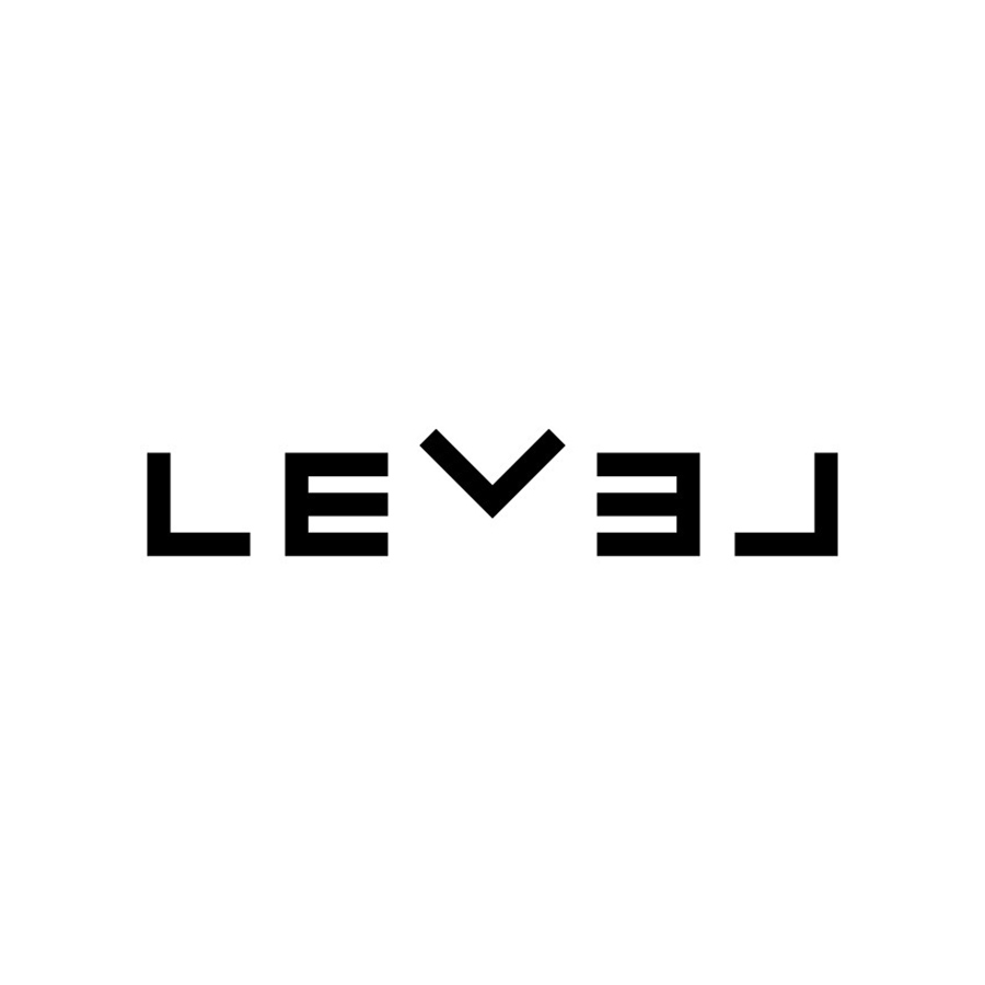
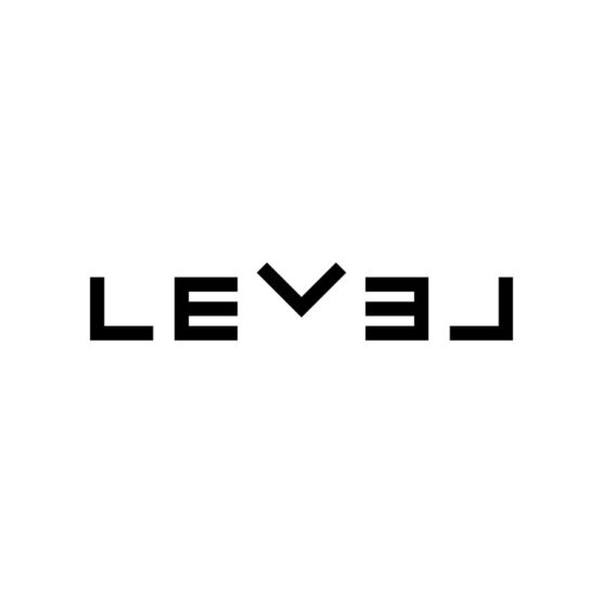
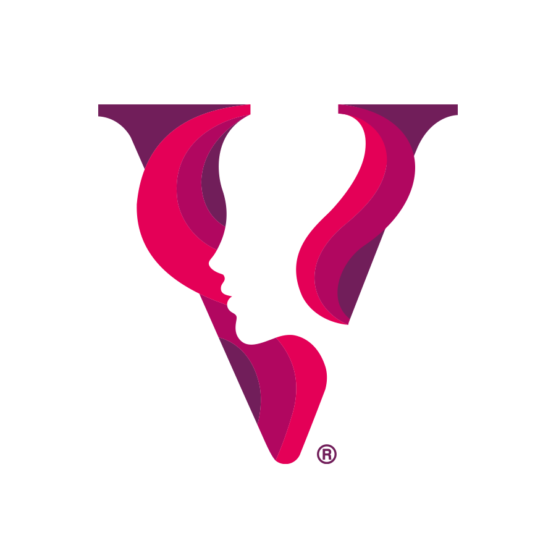
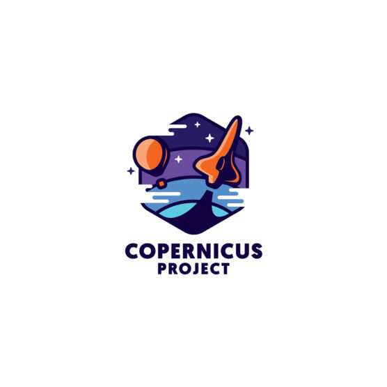
1st Place Winner – Wave #16
DESIGNER
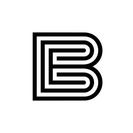
Liam Warsop
AGENCY
Liam Warsop
CLIENT
LEVEL
TAGS
LOGO, IDENTITY
Description
LEVEL is a health and well-being clinic, the client wanted something super clean and minimal. Arrows were a key element in the brand and were requested to be part of the logo design.
This highly contemporary logotype has been designed so that the L’s and V are exactly the same shapes, this creates visual balance and uniformity throughout the logo. These three shapes also double as arrows that can be used as pointing devices and graphics elsewhere in the branding. Lifting the V upwards, amplifies the overall symmetry of the design and creates that unique element nested within the logotype. The V also points to the centre of the logo itself, visually representing finding balance within yourself.

1st – Tyler Frisbee

2nd – Kamran Akram

3rd Place – Carlos Fernandez

4th Place – Eva Nestell
5th Place – Filippo Barina

1st – Francesco Vittorioso
2nd – Zalo Estévez

3rd – Dmitry Lepisov
4th – Costa Mamangakis

5th – Lorenzo Decaro

1st Place – Ramprasad Raju

2nd Place – Tyler Frisbee

3rd Place – Daniele Maniezzo

4th Place – James Barnard

5th Place – Paulo Rogerio

1st Place – Madeleine Godwin

2nd Place – Tyler Frisbee
3rd Place – Zalo Estévez

4th Place – Motif Brands
5th Place – Tyler Frisbee
1st Place – Liam Warsop

2nd Place – LightBox

3rd Place – Aaron Johnson

4th Place – Ilan Geva

5th Place – James Barnard

1st – Jason Craig

2nd – Juan Carlzon

3rd – Emanuele Abrate

4th – Mateusz Machalski

5th – Tyler Frisbee

1st Place – Emanuele Abrate

2nd Place – Jon Allison
3rd Place – Matt Esckelson
4th – Francesco Vittorioso

5th Place – Diana Molyte
1st Place – Carlos Fernandez

2nd Place – Tyler Frisbee
3rd Place – Björn Berglund

4th Place – Motif Brands

5th Place – Jon Allison

1st Place – Matt Esckelson
2nd Place – Kieran Hawes

3rd Place – Aaron Johnson
4th Place – Hashem Gerashi
5th Place – Peper Pascual

1st Place – Carlos Fernandez

2nd Place – Adolfo Teixeira

3rd Place – Christopher Reed

4th Place – Adolfo Teixeira

5th Place – Carlos Fernandez

1st Place – Kamran Akram

2nd Place – Emanuele Abrate

3rd Place – Jon Allison

4th Place – Shyam Agarwal

5th Place – Logan Brazeau
1st Place – Marcin Usarek
2nd Place – Logan Brazeau
3rd Place – Aaron Johnson
4th Place – Liam Warsop
5th Place – Charlotte Downs

1st Place – Neil Bowen

2nd – Bob Mytton & Ed Robin
3rd Place – Martyn Hellewell

4th Place – Shaun Green

5th Place – Logan Brazeau
1st Place – Filippos Pente
2nd Place – Shift Design
3rd Place – Shift Design
5th Place – Steve Leacock

4th Place – Martyn Hellewell
2nd Place – Liam Jackson
3rd Place – Mr Simc
4th – Costa Mamangakis
5th Place – Mark Farris

1st Place – Mr. Simc
2nd Place – Justen Hong
4th – Katherine Howell-Kiser

5th Place – Rich Scott

1st Place – Tandem

2nd Place – Chris Grey
3rd Place – Filippos Pente
4th Place – Filippos Pente
5th Place – Rocky Gonzales
1st Place – Filippos Pente
2nd – Costa Mamangakis

3rd Place – Kira Chao
4th Place – Jon Ringger
5th Place – Shyam Agarwal
1st Place – Frauke Meyer
2nd Place – Filippos Pente
3rd Place – Casandra Clark
4th Place – Chris Grey
5th Place – Sam Aylard
1st Place – Samadara Ginige
2nd – Costa Mamangakis

3rd Place – Corinna Djaferis
4th Place – Nuno Pereira