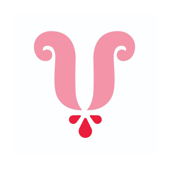
1st Place Winner – Wave #19
DESIGNER
Francesco Vittorioso
AGENCY
Francesco Vittorioso
CLIENT
Bimbly
TAGS
LOGO, IDENTITY
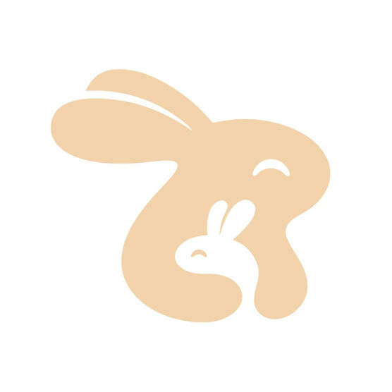
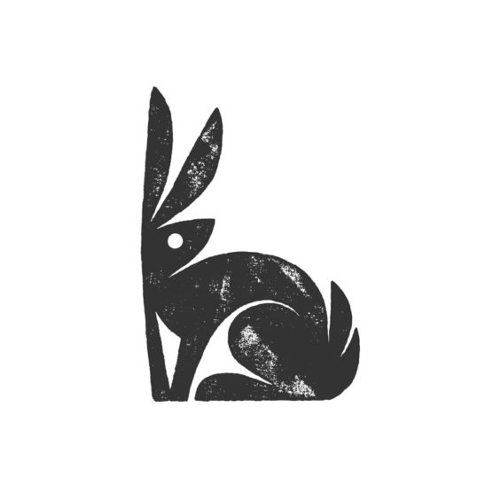
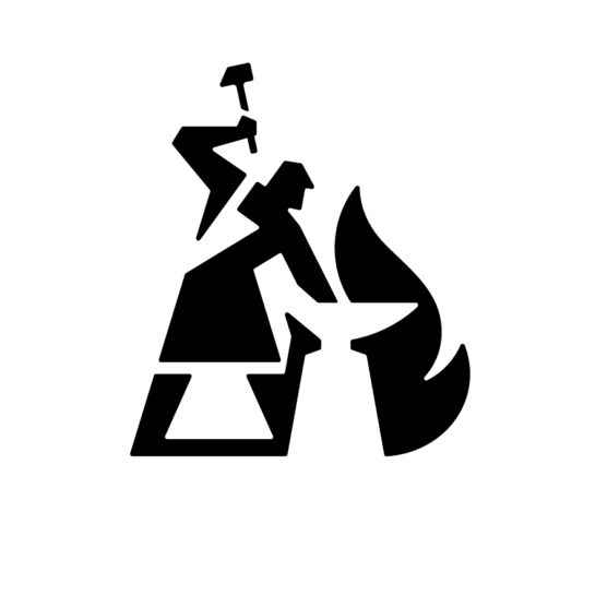
Description
Bimbly is a Swiss brand specializing in the production of silicone items for children, designed to combine safety, design, and tenderness. The name comes from the union of Bimble: a peaceful journey that evokes the first steps of a child in the world under the loving guidance of their protector, and Ly: a way of being, telling a story of love translated into a warm and reassuring embrace.
The logo depicts a mother hare embracing her baby, a symbol of deep connection and protection. The choice of the hare is about the Swiss natural environment, while the use of positive and negative space visually conveys the idea of a unique and inseparable bond.
Every detail of the logo – from the soft shapes to the balanced composition – is designed to embody Bimbly’s philosophy: a brand that accompanies children and their families with tenderness, safety, and timeless style.
Bimbly is not just an icon; it is a story: Every step, every touch, every discovery. Always together.
1st – Francesco Vittorioso
2nd – Zalo Estévez

3rd – Dmitry Lepisov

4th – Costa Mamangakis

5th – Lorenzo Decaro

1st Place – Ramprasad Raju
2nd Place – Tyler Frisbee

3rd Place – Daniele Maniezzo

4th Place – James Barnard

5th Place – Paulo Rogerio
1st Place – Madeleine Godwin

2nd Place – Tyler Frisbee
3rd Place – Zalo Estévez

4th Place – Motif Brands
5th Place – Tyler Frisbee
1st Place – Liam Warsop

2nd Place – LightBox

3rd Place – Aaron Johnson
4th Place – Ilan Geva

5th Place – James Barnard
1st – Jason Craig

2nd – Juan Carlzon
3rd – Emanuele Abrate
4th – Mateusz Machalski

5th – Tyler Frisbee
1st Place – Emanuele Abrate

2nd Place – Jon Allison
3rd Place – Matt Esckelson
4th – Francesco Vittorioso
5th Place – Diana Molyte
1st Place – Carlos Fernandez

2nd Place – Tyler Frisbee
3rd Place – Björn Berglund

4th Place – Motif Brands

5th Place – Jon Allison

1st Place – Matt Esckelson
2nd Place – Kieran Hawes

3rd Place – Aaron Johnson
4th Place – Hashem Gerashi
5th Place – Peper Pascual
1st Place – Carlos Fernandez

2nd Place – Adolfo Teixeira

3rd Place – Christopher Reed

4th Place – Adolfo Teixeira

5th Place – Carlos Fernandez

1st Place – Kamran Akram
2nd Place – Emanuele Abrate

3rd Place – Jon Allison

4th Place – Shyam Agarwal
5th Place – Logan Brazeau
1st Place – Marcin Usarek
2nd Place – Logan Brazeau
3rd Place – Aaron Johnson
4th Place – Liam Warsop
5th Place – Charlotte Downs

1st Place – Neil Bowen

2nd – Bob Mytton & Ed Robin
3rd Place – Martyn Hellewell

4th Place – Shaun Green
5th Place – Logan Brazeau
1st Place – Filippos Pente
2nd Place – Shift Design
3rd Place – Shift Design
5th Place – Steve Leacock
4th Place – Martyn Hellewell
2nd Place – Liam Jackson
3rd Place – Mr Simc
4th – Costa Mamangakis
5th Place – Mark Farris
1st Place – Mr. Simc
2nd Place – Justen Hong
4th – Katherine Howell-Kiser

5th Place – Rich Scott
1st Place – Tandem

2nd Place – Chris Grey
3rd Place – Filippos Pente
4th Place – Filippos Pente
5th Place – Rocky Gonzales
1st Place – Filippos Pente
2nd – Costa Mamangakis

3rd Place – Kira Chao
4th Place – Jon Ringger
5th Place – Shyam Agarwal
1st Place – Frauke Meyer
2nd Place – Filippos Pente
3rd Place – Casandra Clark
4th Place – Chris Grey
5th Place – Sam Aylard
1st Place – Samadara Ginige
2nd – Costa Mamangakis

3rd Place – Corinna Djaferis
4th Place – Nuno Pereira